At the pub with a time series
When following the variation of some quantity over time, it is termed a time series. For example, when plotting the number of births per month in New York city from 1946-1960, there is a peak each summer (seasonability). There is also long-term growth in the number of births each year (a trend).

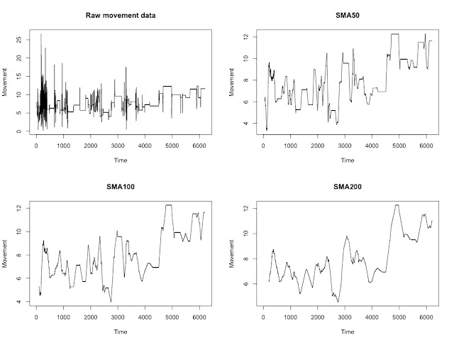
The pilot data below comes from an accelerometer showing the amount of movement produced by an individual over time. This sensor is worn around the neck and produces a data point every second.

To keep things interesting, I should mention that the individual wearing this sensor was at the pub for around 2 hours and while there consumed 2 units of alcohol. The rapid spike at the start shows them walking down the stairs to the bar (conveniently located below the School of Psychology).
Due to the large number of data points and variation within the data, it is almost impossible to get an idea of what is going on as the evening progresses (if anything!). Although we might predict that visits to the bar would show an spike in movement, we might also expect a general increase in movement as more alcohol is consumed.
Data Smoothing*
The presence of noise is a common feature in most time series - that is, random (or apparently random) changes in the quantity of interest. This means that removing noise, or at least reducing its influence, is of particular importance. In other words, we want to smooth the signal.
The simplest smoothing algorithm possible is often referred to as the running, moving, or floating average.
The idea is relatively straightforward: for any odd number of consecutive points, replace the centre-most value with the average of the other points. It is possible to adjust the number of points at which the function averages over - the output below shows the original data and a running average using 50, 100 or 200 points.
However, this can have a rather serious drawback.
When a signal has some sudden jumps and occasional large spikes, the moving average is abruptly distorted. One way to avoid this problem is to instead use a weighted moving average, which places less weight on the points at the edge of the smoothing window. Using a weighted average, any new point that enters the smoothing window is only gradually added to the average and gradually removed over time.
That said, in the case of my pilot data, it doesn't make a huge difference to the end result. Probably because the resolution of the original data is very high.

So what can we conclude about this individual at the pub? Well, it looks like there is a general trend suggesting that movement increases as they make additional trips to the bar. The spikes in the WMA200 perfectly illustrate those visits, which itself starts to look like an additional seasonal component.
But is it possible to predict what their pattern of movement might look like after a third drink?
Maybe, but any future forecast could easily be tested......at the pub.
*note: the appropriate R code and information on the TTR moving averages library can be found here.

The pilot data below comes from an accelerometer showing the amount of movement produced by an individual over time. This sensor is worn around the neck and produces a data point every second.

Due to the large number of data points and variation within the data, it is almost impossible to get an idea of what is going on as the evening progresses (if anything!). Although we might predict that visits to the bar would show an spike in movement, we might also expect a general increase in movement as more alcohol is consumed.
Data Smoothing*
The presence of noise is a common feature in most time series - that is, random (or apparently random) changes in the quantity of interest. This means that removing noise, or at least reducing its influence, is of particular importance. In other words, we want to smooth the signal.
The simplest smoothing algorithm possible is often referred to as the running, moving, or floating average.
The idea is relatively straightforward: for any odd number of consecutive points, replace the centre-most value with the average of the other points. It is possible to adjust the number of points at which the function averages over - the output below shows the original data and a running average using 50, 100 or 200 points.

When a signal has some sudden jumps and occasional large spikes, the moving average is abruptly distorted. One way to avoid this problem is to instead use a weighted moving average, which places less weight on the points at the edge of the smoothing window. Using a weighted average, any new point that enters the smoothing window is only gradually added to the average and gradually removed over time.
That said, in the case of my pilot data, it doesn't make a huge difference to the end result. Probably because the resolution of the original data is very high.

So what can we conclude about this individual at the pub? Well, it looks like there is a general trend suggesting that movement increases as they make additional trips to the bar. The spikes in the WMA200 perfectly illustrate those visits, which itself starts to look like an additional seasonal component.
But is it possible to predict what their pattern of movement might look like after a third drink?
Maybe, but any future forecast could easily be tested......at the pub.
*note: the appropriate R code and information on the TTR moving averages library can be found here.

Comments
Post a Comment