Kernel Density Plots: Has the histogram had its day?
Simple statistical concepts include the mean, median, standard deviation, and percentiles. These are useful for summarising data. Except these summary statistics are only useful under certain circumstances. When basic assumptions are not met, then any conclusions based on simple summary statistics are likely to be inaccurate. Unable to give a hint as to what is wrong, the numbers can often look perfectly reasonable.
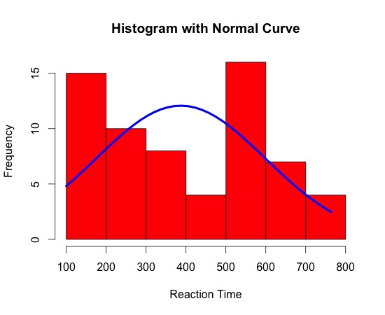
Lets consider a sample of 64 reaction time observations (in milliseconds):


Histograms are, however, easy to understand and calculate. But the fact that something is easy and popular doesn't make it right.
'The purpose of computing is insight, not pictures'
L. N. Trefethen
Update 15/10/2012
Update 13/10/2013**
Bandwidth may need to be adjusted in some instances. However, R is pretty good at selecting a default that will accommodate most data sets.
*To produce KDEs for a given variable 'x' and a KD plot in R, use the following code:
d <- density(x) # returns the density data
plot(d, main='Kernal Density Plot') # plots the graph
**to specify bandwidth:
plot(d, main='Kernal Density Plot', bw=#) # plots the graph
Lets consider a sample of 64 reaction time observations (in milliseconds):
Mean = 387ms
Median = 340ms
These look ok, until you view the distribution, which is not unimodal.
These look ok, until you view the distribution, which is not unimodal.
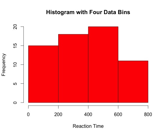
Despite being a staple in data visualisation, histograms can often be a poor method for determining the shape of a given distribution because they are strongly affected by the number of bins used. For example, visualising the same data with only four bins can make the same observations appear normally distributed. Similarly, a box-plot can also hide data irregularities and, like histograms, they do not handle outliers gracefully.
So is there an alternative?
Well yes, there are several, but I think Kernel Density plots (KDP) are a more effective way to illustrate the distribution of a variable. This is now surprisingly easy to do. To form a *KDP, a kernel - that is, a smooth, strongly peaked function - is placed at the position of each data point. The contributions from all kernels are added to obtain a smooth curve, which can be evaluated at any point along the x-axis.
Taking the same data set, a Kernel Density Plot is interpreted in a similar manner to a histogram, but avoids the problems outlined earlier.

KDEs require the power of a relatively modern computer to be effective. They cannot be done 'by hand'. Being able to compute KDEs is only possible thanks to the accessibility of modern computing, which in turn provides a new way to think about data. However, they should only be used with larger data sets, as the smoothing can lead to misleading artefacts. There is also a danger in changing things just for the sake of it!Well yes, there are several, but I think Kernel Density plots (KDP) are a more effective way to illustrate the distribution of a variable. This is now surprisingly easy to do. To form a *KDP, a kernel - that is, a smooth, strongly peaked function - is placed at the position of each data point. The contributions from all kernels are added to obtain a smooth curve, which can be evaluated at any point along the x-axis.
Taking the same data set, a Kernel Density Plot is interpreted in a similar manner to a histogram, but avoids the problems outlined earlier.

'The purpose of computing is insight, not pictures'
L. N. Trefethen
Update 15/10/2012
A colleague at work pointed out today that kernel functions come in a variety of flavours.
Update 13/10/2013**
Bandwidth may need to be adjusted in some instances. However, R is pretty good at selecting a default that will accommodate most data sets.
*To produce KDEs for a given variable 'x' and a KD plot in R, use the following code:
d <- density(x) # returns the density data
plot(d, main='Kernal Density Plot', bw=#) # plots the graph

KDE = Kernel Density Estimate :)
ReplyDeleteThanks for this page David.
ReplyDeleteI am learning R and since I am right at the bottom of the R ladder I have been looking at a variety of things as I come across them.
I was presented with a KDP today for the first time ever and I am trying to understand them. However, what I see is a smooth line that looks like my histogram. I appreciate that changing the binwidth can have a big impact on the appearance of a histogram so I am at a loss as to understand the KDP.
Can you give me any further hints?
Best wishes
Duncan
This really helped me wrap my head around kernel density plots. Thank you!
ReplyDelete